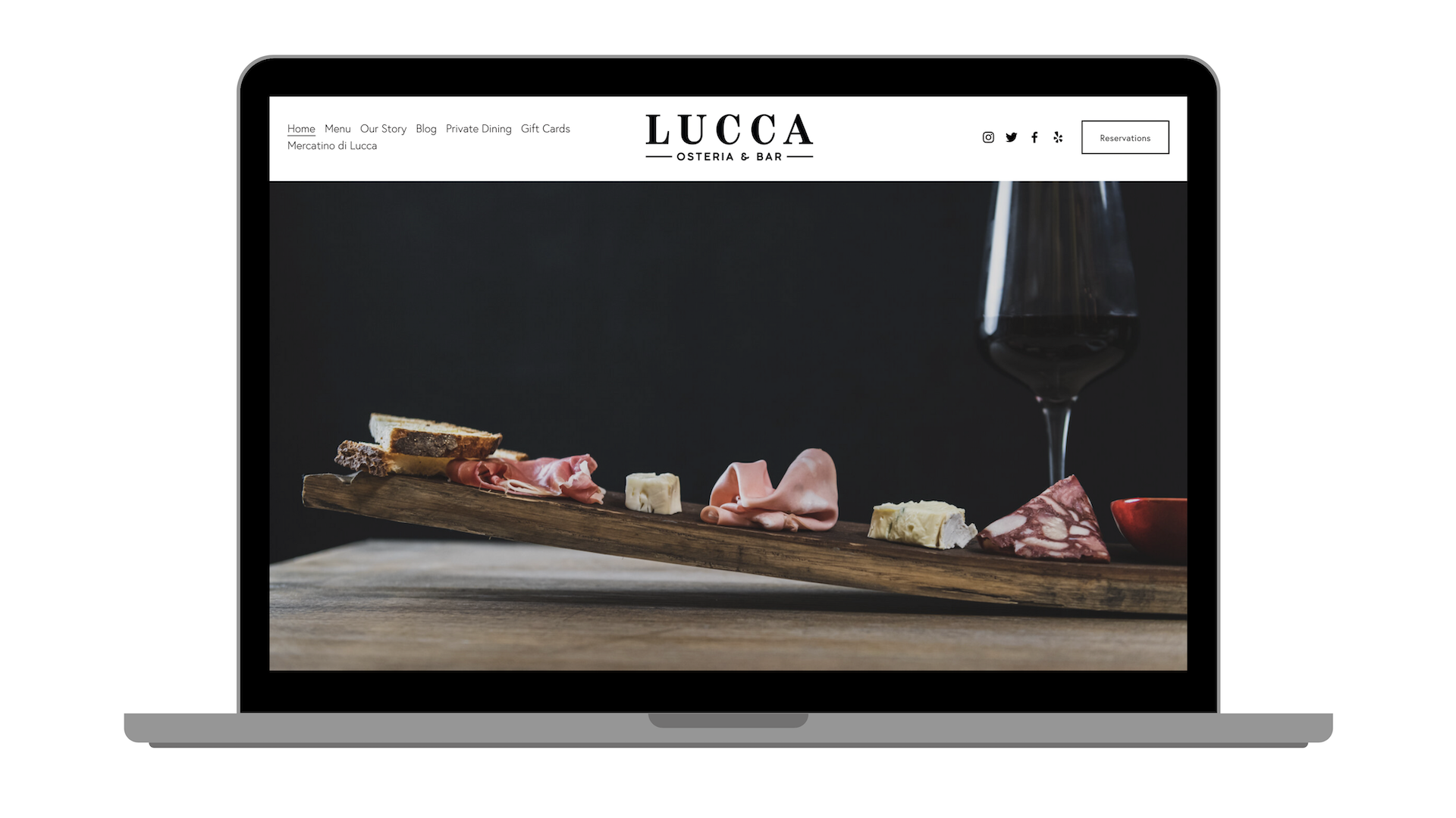
Lucca Osteria & Bar is an Italian restaurant in Oak Brook, Illinois that opened in May 2021. This website design project was particularly special because the chef and visionary behind this restaurant is my father-in-law, Claudio Ulivieri. The design and development work is centered around usability – delivering a great digital experience for everyone who visits the website.
Objectives
- Tell a compelling story explaining the history and concept of the brand
- Design an interface with easy browsing and a frictionless experience
- Create a user-friendly experience with simple navigation
- Focus on SEO performance and content marketing opportunities
- Implement a fully responsive solution so web pages render well on a variety of devices from minimum to maximum display size
Engaging user experience (UX) design is what draws people through the various elements of the site to the intended outcomes. Strong visual design guides visitors’ behavior while interacting with the content, and ultimately converting them from visitor to customer.
The visual objective was to keep the website simple to stay true to their passion for simple, quality ingredients. The aesthetic was inspired by the rustic colors and textures from the town of Lucca, Italy. Bold, professional photography was key to establishing the visual story. As I said, this was a family project through and through. Claudio’s son (my husband) Nick Ulivieri provided us with an extensive collection of photography from family vacations to Italy. Nick and I also worked together to capture all of the food and drink photography we used on this website.
Engagement and List Building
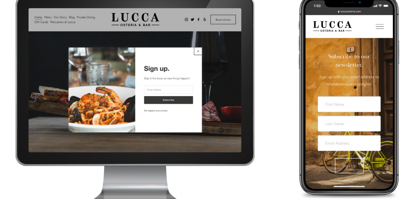
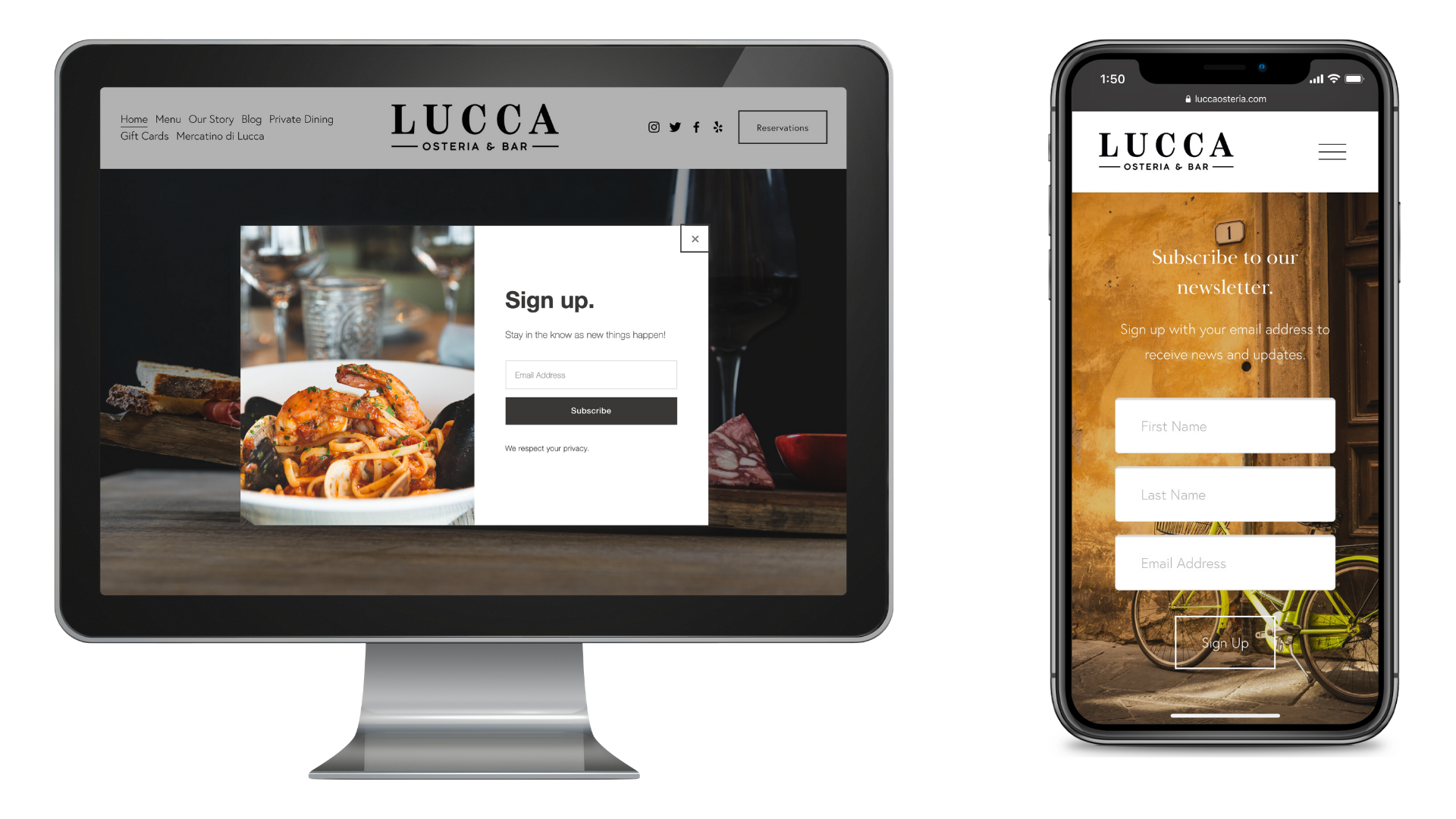
A priority for this new restaurant was to build an organic email marketing list. We achieved this goal by incorporating multiple touch points. A marketing pop-up window is activated 30 seconds after a visitor lands on the website. Visitors are also encouraged to sign up on the homepage. And lastly, we built a stand newsletter sign-up page that can be pushed out through social media outreach. This page is linked in the footer of the website and can be accessed at any time.
Reservations and Blog
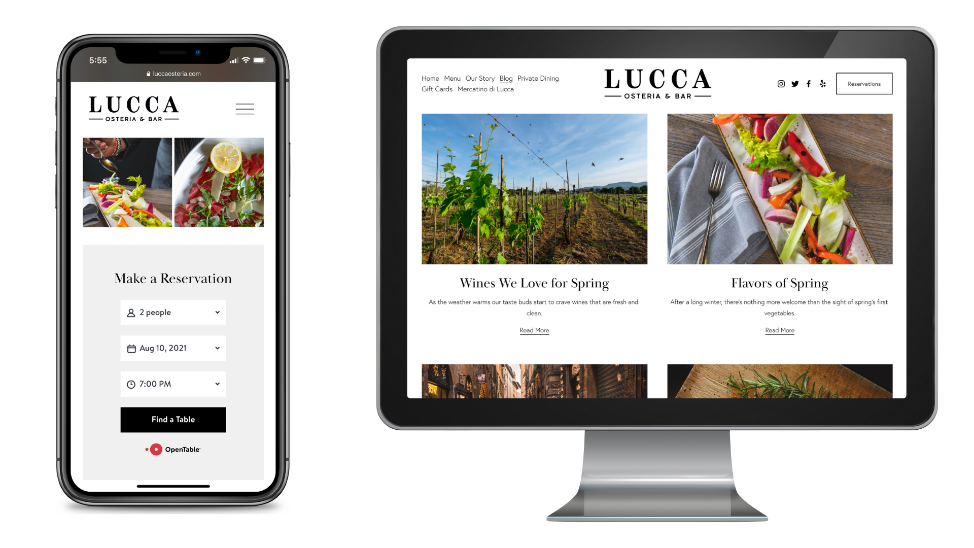
Design without strategy is just decoration. From typography and photography to what options people see in your navigation and how they access menus on mobile devices, every action is well considered. Online reservations is a critical function that needed to be user-friendly and easy to find. To achieve this goal the reservations button featured on the homepage in the upper righthand corner, and is viewable on every page. The OpenTable application is directly embedded on the reservation page. Simple, direct, and functional.
The content strategy was an important part of the website build. We created a blog in order to improve site-wide storytelling to create a stronger connection with customers. This section provides the ability to add original content and educate the visitor about what sets them apart, as well as upcoming specials and events. The blog also helps enhances search engine optimization. By blogging on a regular basis, this keeps the site current, showing the audience they are active and engaged in providing quality, relevant information.
